This Website: Built to the Standard I'd Apply to Yours
A consulting site is easy to fill with claims about engineering standards. I built mine so the claims are checkable — the architecture, the trade-offs, and the automated gates every change has to pass before it ships.
- Role
- Role: Product design, full-stack engineering & QA
- Timeframe
- Timeframe: 2026
Overview
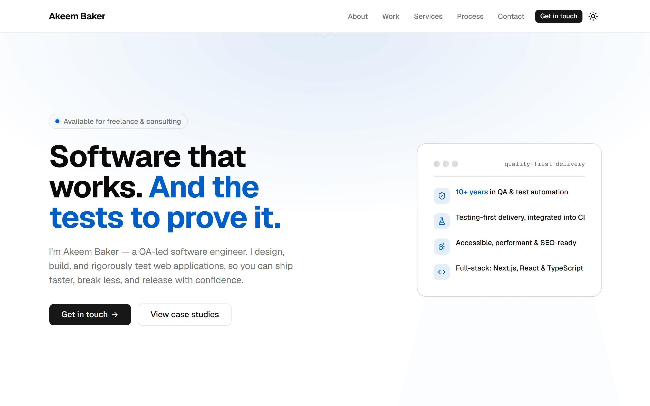
This website is my portfolio — but I treated it as a real product with a real goal: help potential clients quickly decide whether I'm the right person to build their software. That meant it couldn't just claim I deliver high-quality work; it had to demonstrate it.
So I designed and built it end to end as a production-grade application: content-driven, rigorously tested, accessible, fast, and easy to maintain. This case study walks through how I approached it and, more importantly, why — and because the source is public, none of it has to be taken on trust.
The evidence
- accessibility violations, verified automatically on every build
- 0accessibility violations, verified automatically on every build
- of pages statically rendered — no server to secure or slow down
- 100%of pages statically rendered — no server to secure or slow down
- automated gates every change has to pass before it ships
- 6automated gates every change has to pass before it ships
The brief I set myself
The objective was commercial, not decorative: turn visitors into conversations. A consulting site has to build trust in seconds, make it easy to explore proof of work, and remove friction from getting in touch.
It also had to be cheap to run, effortless to update, and able to grow — adding a new case study or service shouldn't mean paying for a rebuild.
What it had to achieve
- Build trust and communicate value within the first few seconds
- Present work as in-depth case studies, not just screenshots
- Be fast, accessible, and discoverable by default
- Be inexpensive to host and simple to maintain
- Scale to new content without engineering work
Key decisions (and the trade-offs)
Static-first, with no database
- Why:
- The site pre-renders to static pages, so it loads almost instantly, costs next to nothing to host, and has no server or database to secure or maintain.
- Alternatives considered:
- A database-backed CMS would allow instant edits, but adds cost, complexity, a security surface, and slower pages — overkill for a site that changes when I choose to publish.
Separate content from design
- Why:
- All text and data live in a typed, validated content layer, kept completely separate from the visual components. Updates are quick and safe, and invalid content is caught automatically before it can ever go live.
- Alternatives considered:
- Hard-coding text into the design is faster on day one, but turns every future edit into a developer task and risks shipping broken pages.
Build quality in — testing and accessibility from the start
- Why:
- Automated tests and accessibility checks run on every change, so regressions are caught before release and the site works for everyone, on every device. Quality is proven, not promised.
- Alternatives considered:
- Leaving testing until 'later' is the industry default — and a big reason so many sites ship bugs and inaccessible experiences. Building it in costs a little upfront and saves far more downstream.
A reusable case-study platform
- Why:
- Case studies are assembled from typed content blocks, so adding a new project — or a whole new type of section — is a content task, not a redesign.
- Alternatives considered:
- Hand-designing each case study looks bespoke but doesn't scale; the site would need developer time every time the portfolio grows.
Every change has to earn its way in
Six automated gates stand between a change and production: formatting, linting, type-checking, unit tests, a production build, and end-to-end tests in a real browser — including an accessibility audit that has to report zero issues. Nothing ships unless every one of them passes.
This is the same discipline I bring to client work: catch problems early, keep the codebase healthy, and make it safe to move quickly without breaking what already works.
How it's built
Framework & language
- Next.js
- React
- TypeScript
Design & UI
- Tailwind CSS
- shadcn/ui
- Motion
Quality & delivery
- Playwright
- Vitest
- axe-core
- GitHub Actions
- Vercel
A look under the hood
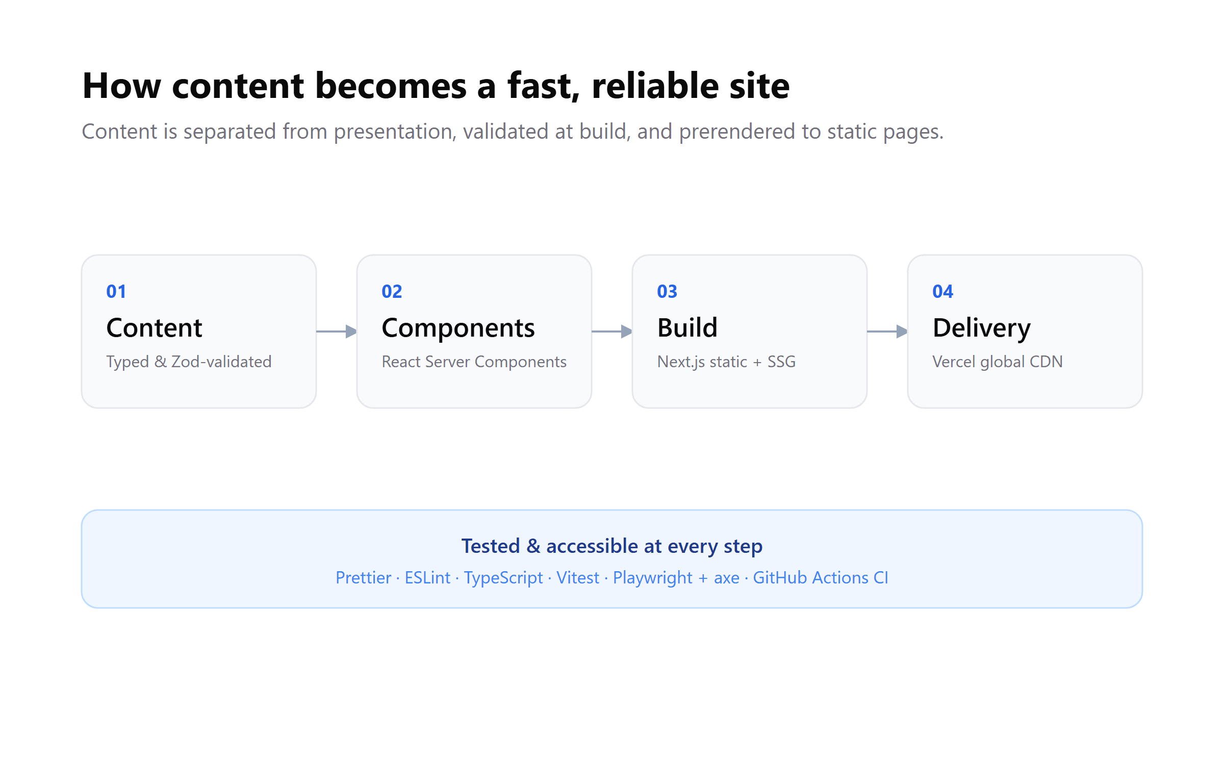
How content flows from typed, validated data to a fast, static site — tested and accessible at every step. 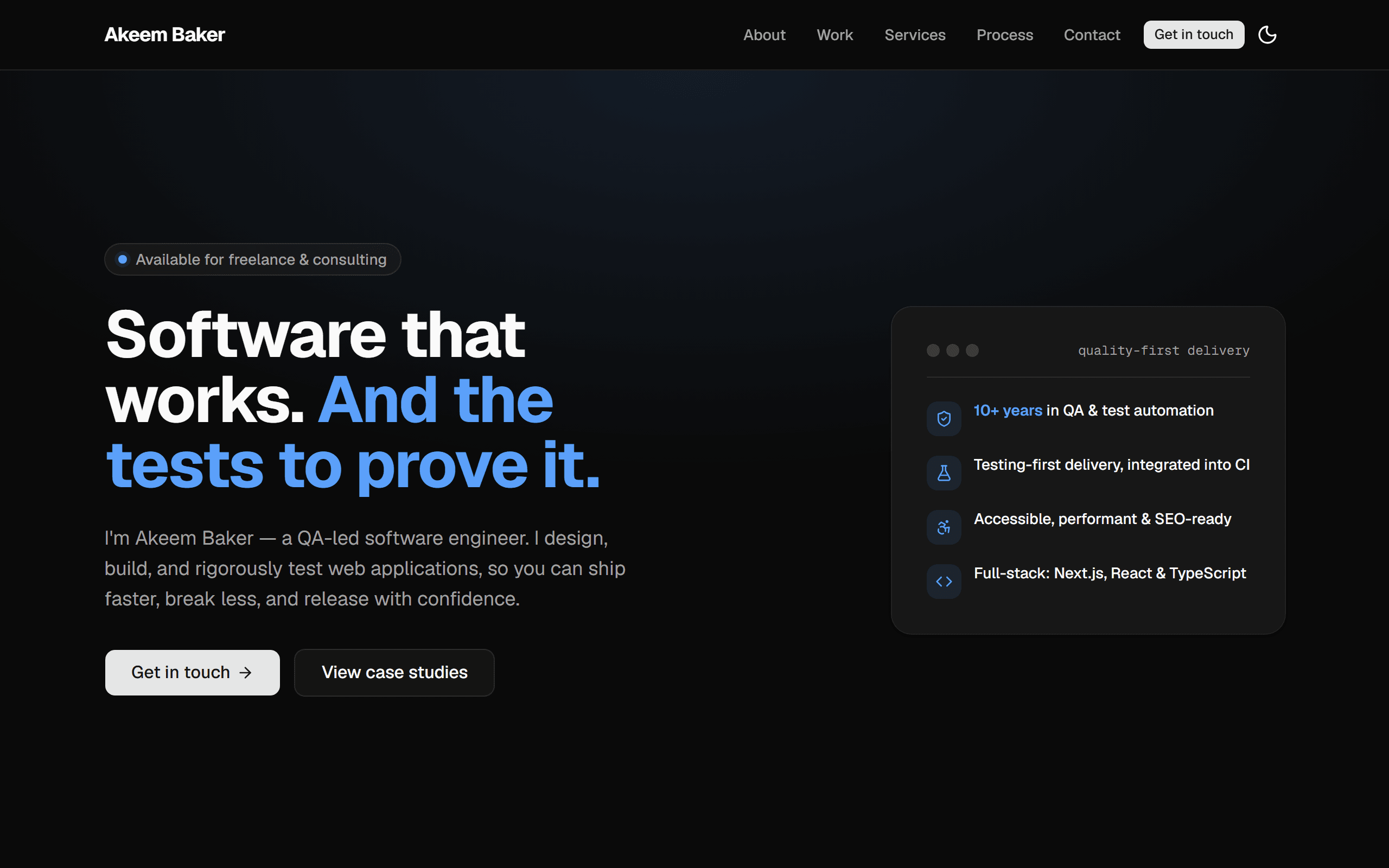
The same site in dark mode — theming built in from the start.
What this means for you
If you're hiring someone to build software, this site is the proof: it's the standard I hold my own work to, and the standard I'd apply to yours — fast, accessible, tested, maintainable, and built to grow.
More than the specific technologies, it shows how I think: weighing trade-offs against your goals, building quality in rather than bolting it on, and making decisions that keep the long-term cost of ownership low.
Tags
- Next.js
- TypeScript
- Testing
- Accessibility
- SEO
- Tailwind CSS
Related projects
 Personal2026 – present
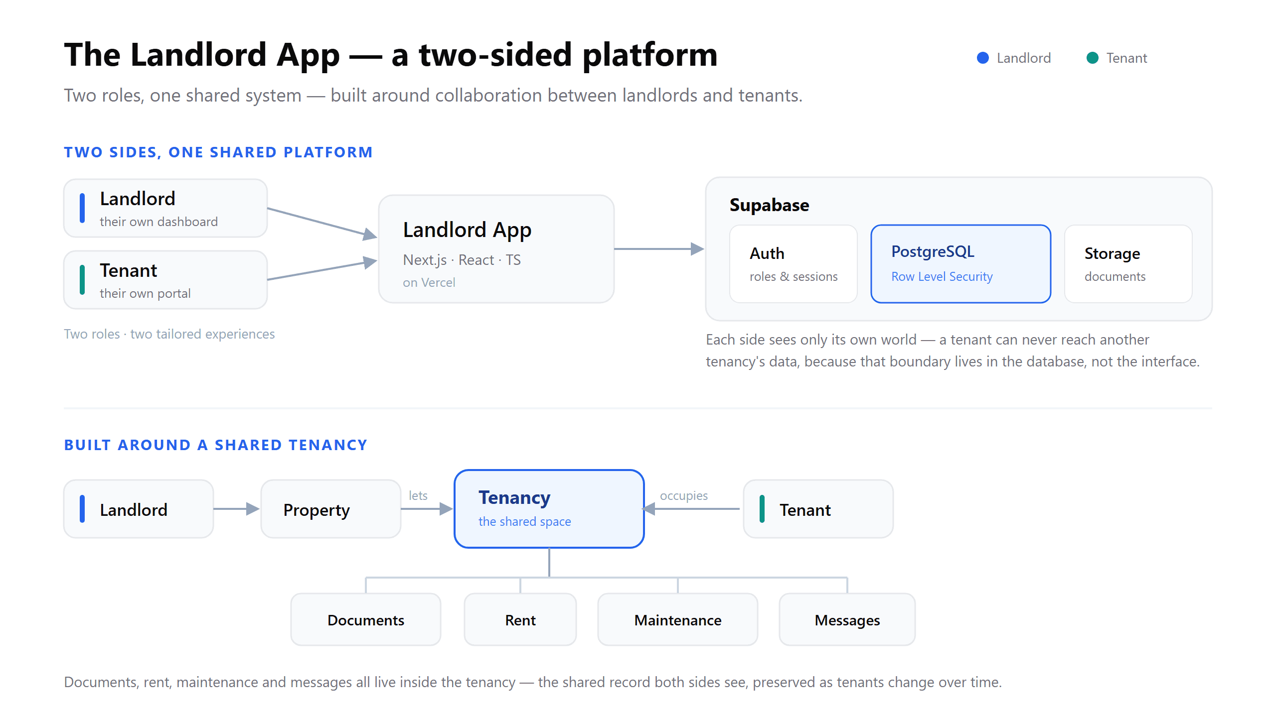
The Landlord App: Property Management, Built Quality-First
A two-sided property management platform for self-managing UK landlords and their tenants — and a look at how I design a product for reliability, security and long-term growth from day one.
- Next.js
- TypeScript
- Supabase
- PostgreSQL